Gresham Index · Research note #2 · July 2026
Why 1.5% and not 2.5%? Why 0.75 and not 0.6? The honest answer: it barely matters and we can prove it.
2026/07/20
Every strategy built on thresholds owes its users an answer to "why these numbers?" Most vendors answer with "proprietary optimization." We ran the optimization they claim to have run 162 parameter variations across two accounting models and are publishing why we refused to take the winning one.
The experiment
Our strategy uses risk bands (buy 3× below 0.15, 2× below 0.30, hold between 0.65–0.75, sell above 0.75) and sell tranches of 1.5% and 4% of holdings per week. None of these values was fitted to data they were chosen as round, theory-first numbers before any backtest ran. To test whether that mattered, we perturbed everything: the sell threshold from 0.70 to 0.80, sell fractions from half to 1.5× their size (0.75%/2% up to 2.25%/6%), reserve deployment from 10% to 20% per week, and every buy-band edge shifted by ±0.05. Eighty-one combinations, run under both of our published accounting models 162 full backtests over 2014–2026, each compared to plain DCA.
The plateau: every tested variation of bands and sell fractions beats plain DCA
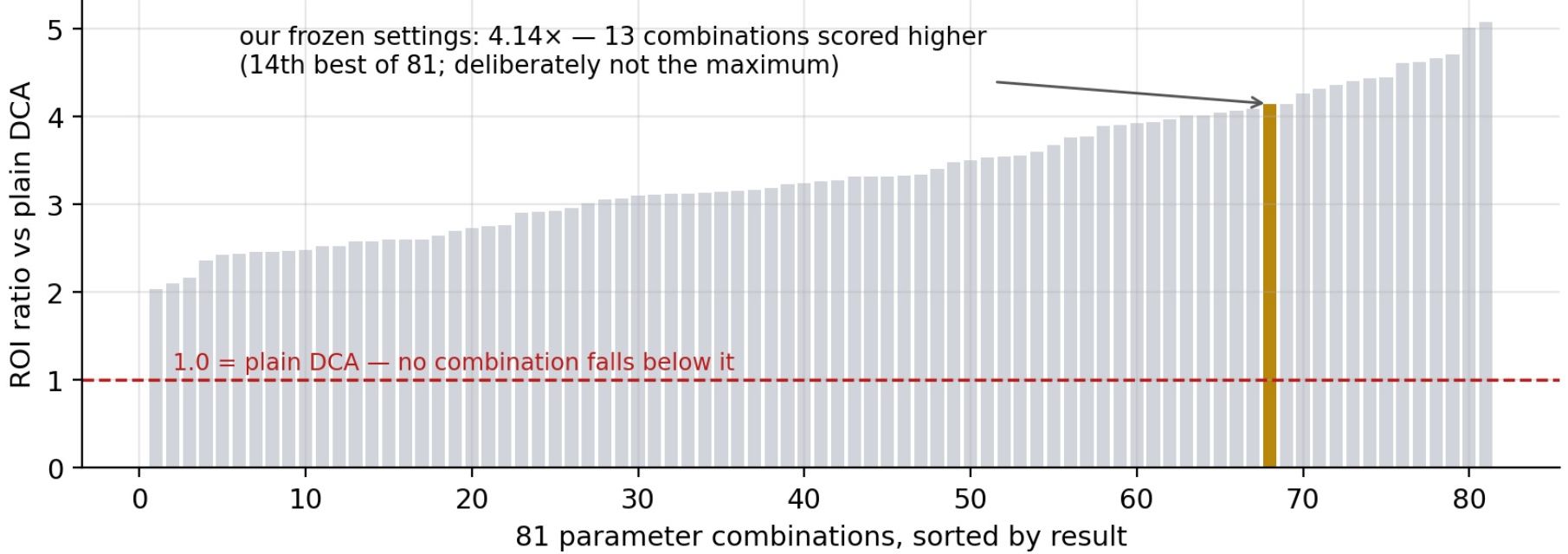
Figure — All 81 combinations under the committed-saver model, sorted by ROI ratio vs plain DCA. The surface is a plateau: the worst variation still doubles plain DCA's return ratio; the spread between neighbors is smaller than what three market cycles can statistically resolve.
The result: a plateau, not a peak
Every one of the 162 combinations beat plain DCA, the worst by a factor of 2.04× on return per deposited dollar. One dial turned out to be entirely irrelevant (the reserve deployment rate: 10%, 15% and 20% all land within noise of each other). Band shifts of ±0.05 move the median result by well under 10%. In other words: the performance does not come from the numbers. It comes from the structure, which bands exist and what they do — and the structure was searched far more aggressively than the decimals.
"The structure has been searched more thoroughly than the numbers, deliberately. Structure is where real differences live; the numbers are a plateau."
| Structural alternative tested | Result | Why it was rejected |
|---|---|---|
| Macro liquidity input (US M2, both signs) | edge fell by ~half | raised risk reading at the 2022 bottom — blocked the best buys |
| Halving-cycle timing as an input | within noise (+2pp) | would make the metric depend on the 4-year cycle persisting |
| Delayed-start exits (wait N weeks) | fixed 2017, then failed | zero exit signals in every cycle after May 2021 |
| Accelerating sell tranches | +212% in-sample | supercycle stress test collapses to −68%; pure regime bet |
| One-shot exit ladders (sell to 100%) | +51% vs our +125% | missed the 2025 top entirely; destroyed in a supercycle |
| "Only buy the dips" (green-only buying) | −22% vs plain DCA | out of the market 71% of the time; timing never repaid it |
Each of these is documented in full, including the numbers, in our public specification. Structure is testable and was tested. The decimals are not identifiable from three market cycles, and anyone claiming otherwise is describing curve-fitting.
The winning combination we refused to take
The grid has a champion: sell earlier, sell 50% harder, buy more aggressively. 5.07× versus our 4.14×. We are not adopting it, for two reasons we consider more important than backtest points. First, the winner's curse: the best cell of 81 owes part of its score to the act of selection itself; its expected future performance is systematically below its in-sample number, while unselected round values carry no such penalty. Second, the direction of the improvement is a bet: every step toward heavier selling is a step toward assuming a deep bear market always follows every top, which history delivered three times and the future does not owe us. Our stress tests quantify exactly this trade: the most aggressive selling variants gained the most in-sample and lost the most in a simulated supercycle. A strategy tuned to the past three cycles is a strategy that breaks with the fourth.
Our frozen settings rank 14th of 81 above the median, nowhere near the maximum. That is the fingerprint of numbers that were chosen, not fitted. If we ranked first, you should trust us less.
What this means for you
When you see a tool advertising precisely optimized thresholds "our proprietary model sells at exactly 0.8734" you are looking at a memorized past. Bitcoin's entire modern history contains roughly three full cycles: enough to validate a structure, nowhere near enough to identify optimal decimals. We publish this experiment so the answer to "why these numbers?" is permanent and checkable: because nearby numbers all work, ours are the round ones, and the ones that scored higher would have required betting that the future repeats the past exactly. The methodology, formulas, and complete validation record, including everything above, are published in specification v1.0.1 and reproducible from public data.
Companion note: "We backtested 37,072 market scenarios" (Research Note #1).
This document is informational and educational only and is not investment advice. Backtested performance does not guarantee future results. Crypto-assets are highly volatile; invest only what you can afford to lose.